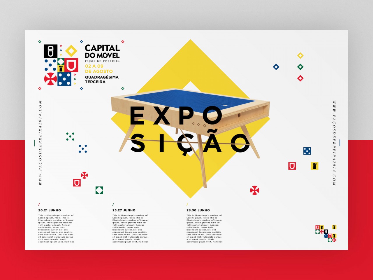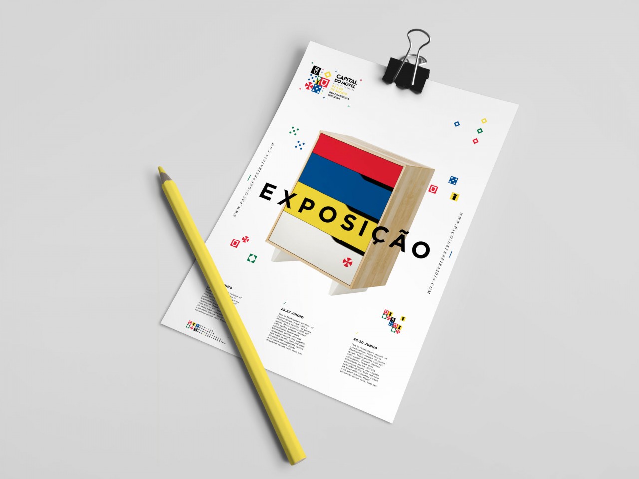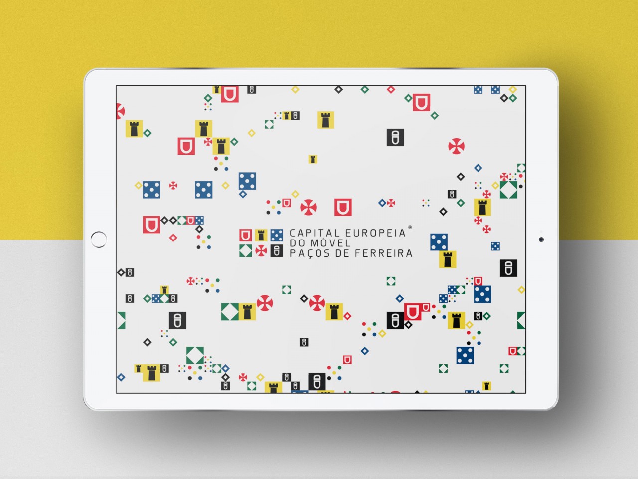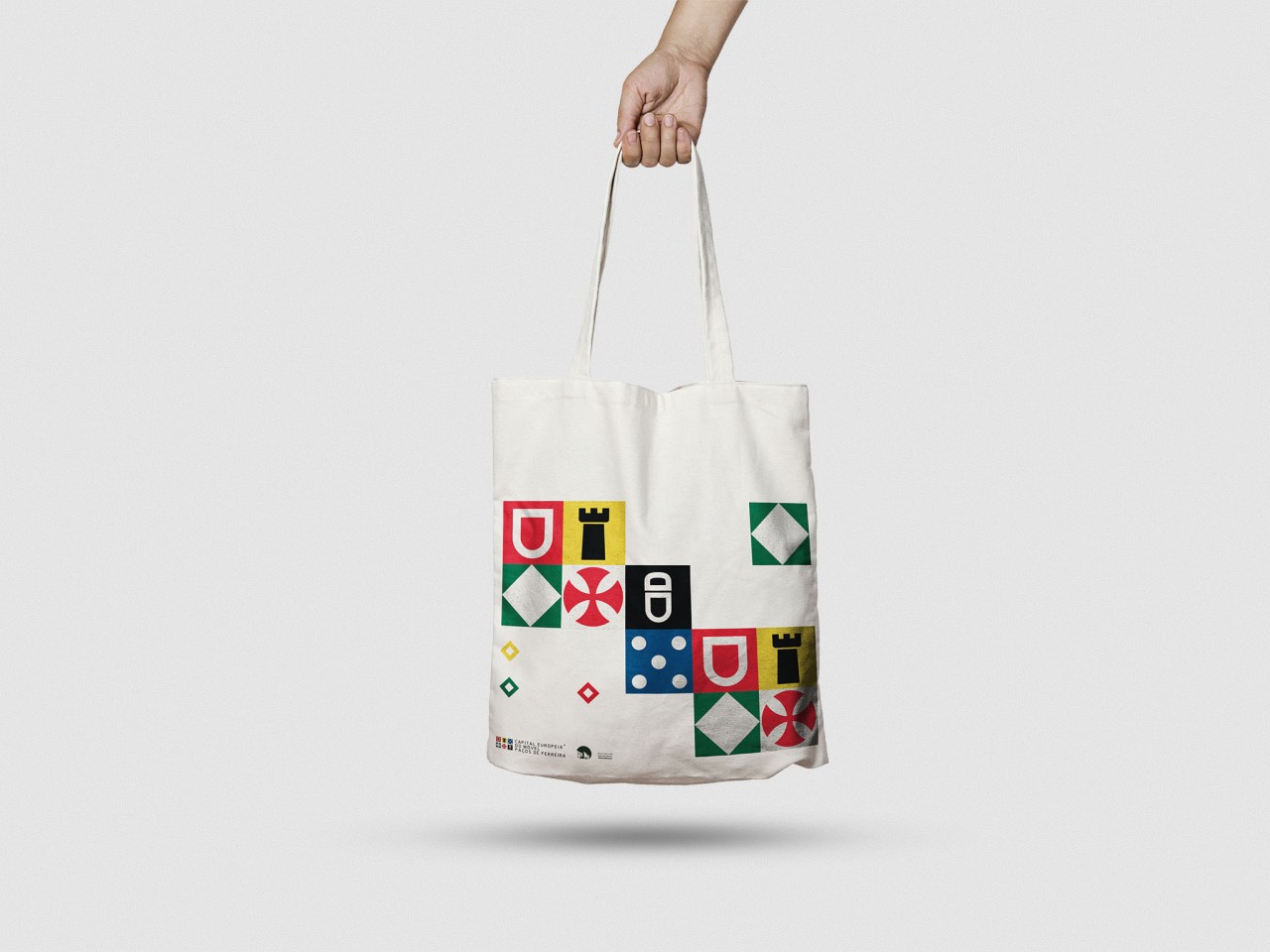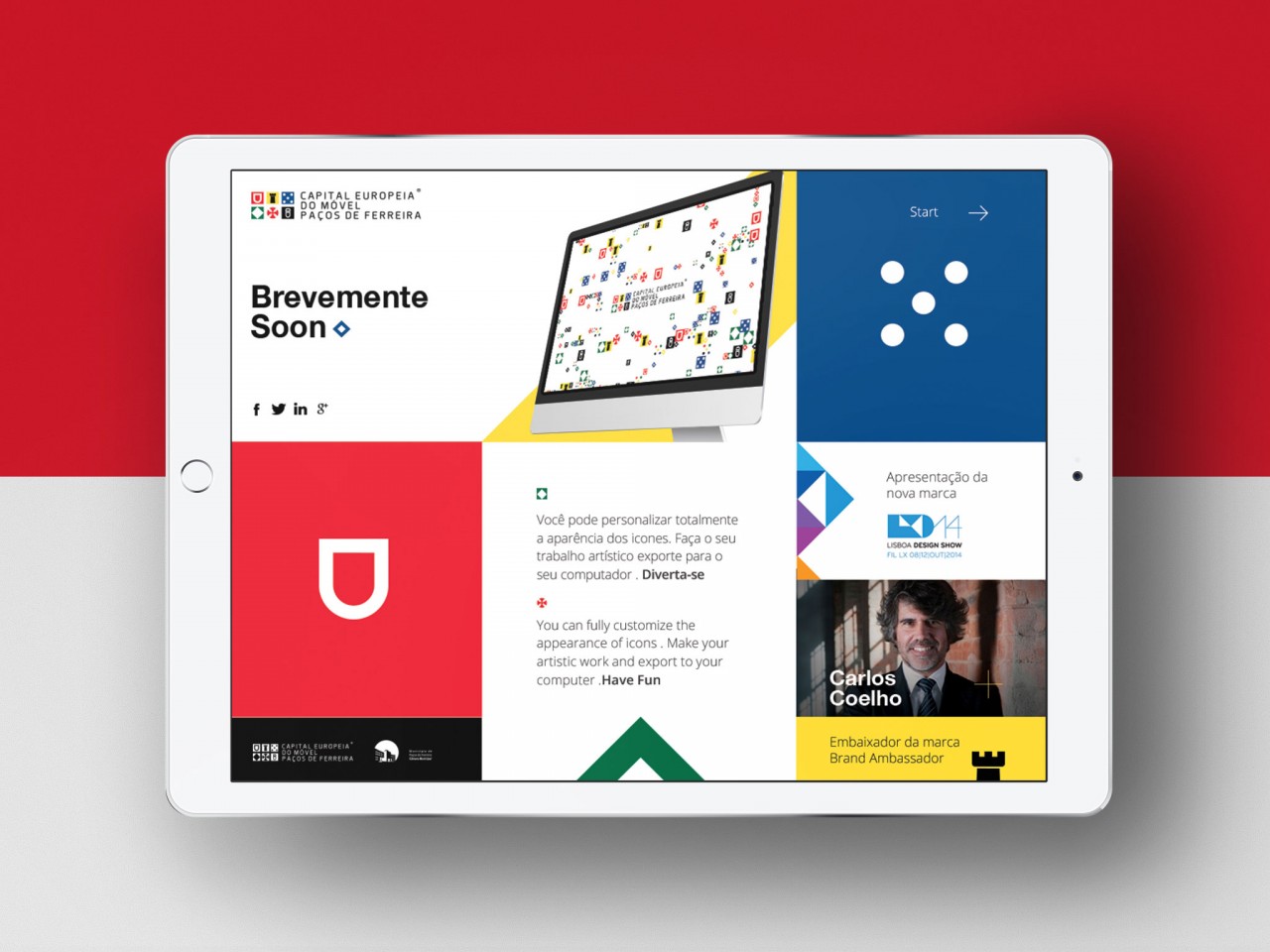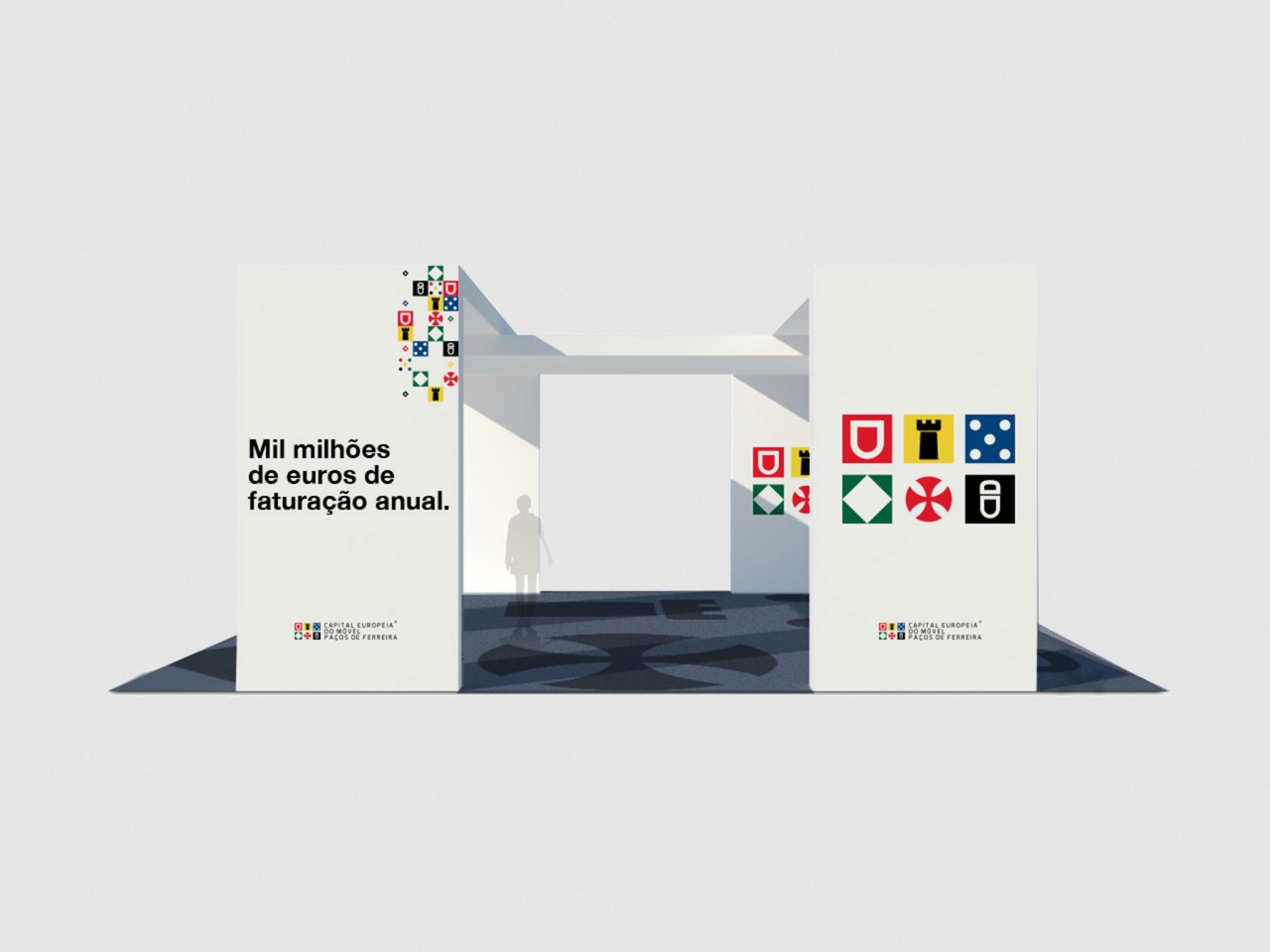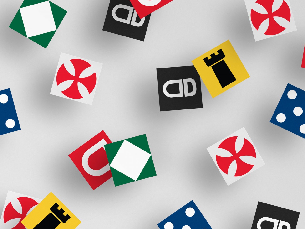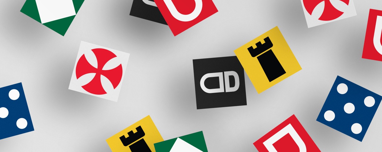
The mission of lifting the essence of a European Capital, through a graphic representation, was not to create just a graphic symbol like many others. A thorough concept worked on historical foundations, and with the strength and bravery of a people in search of new horizons, this began a new battle. With the construction of a single, dynamic and representative language Paços de Ferreira and Portugal, comes a visual code that can be uses contemporaneously.
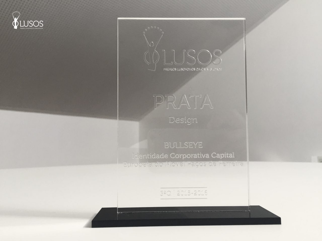
Capital Europeia do Móvel Paços de Ferreira brand identity has won a silver award, with their corporate identity, at the international festival “Prémios Lusófonos da Criatividade“.
See more Bullseye branding projects.
