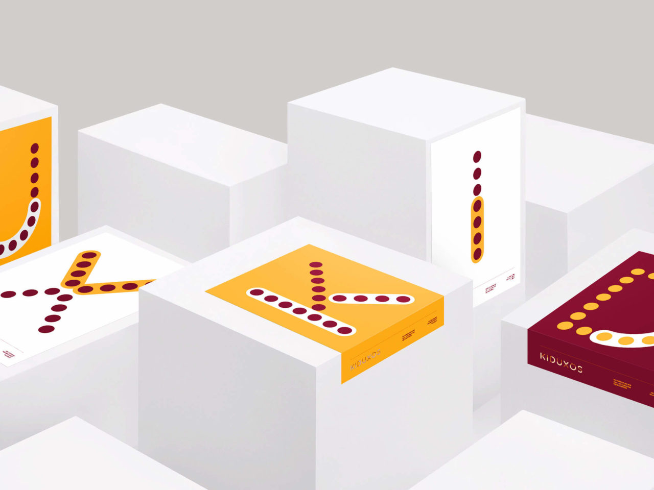
The idea comes from two friends, Lucia and Marta, who throw us the challenge of giving vent to the imagination, and create the form of their project.
With no idea of the name, one thing was certain: the brand would be fun, jovial and plunge us into a world full of colors and fantasy.
The creation of the name appears succinctly:
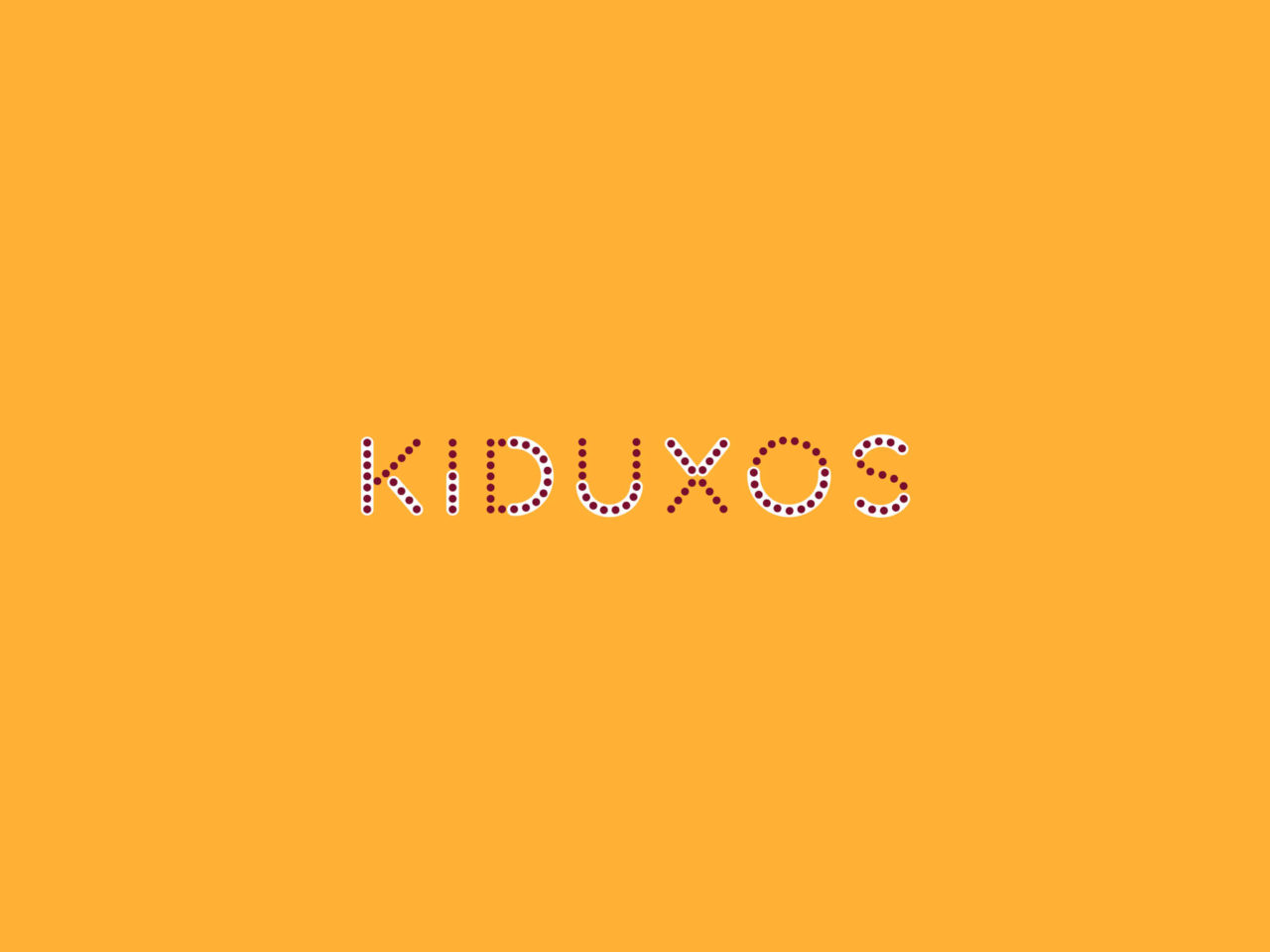
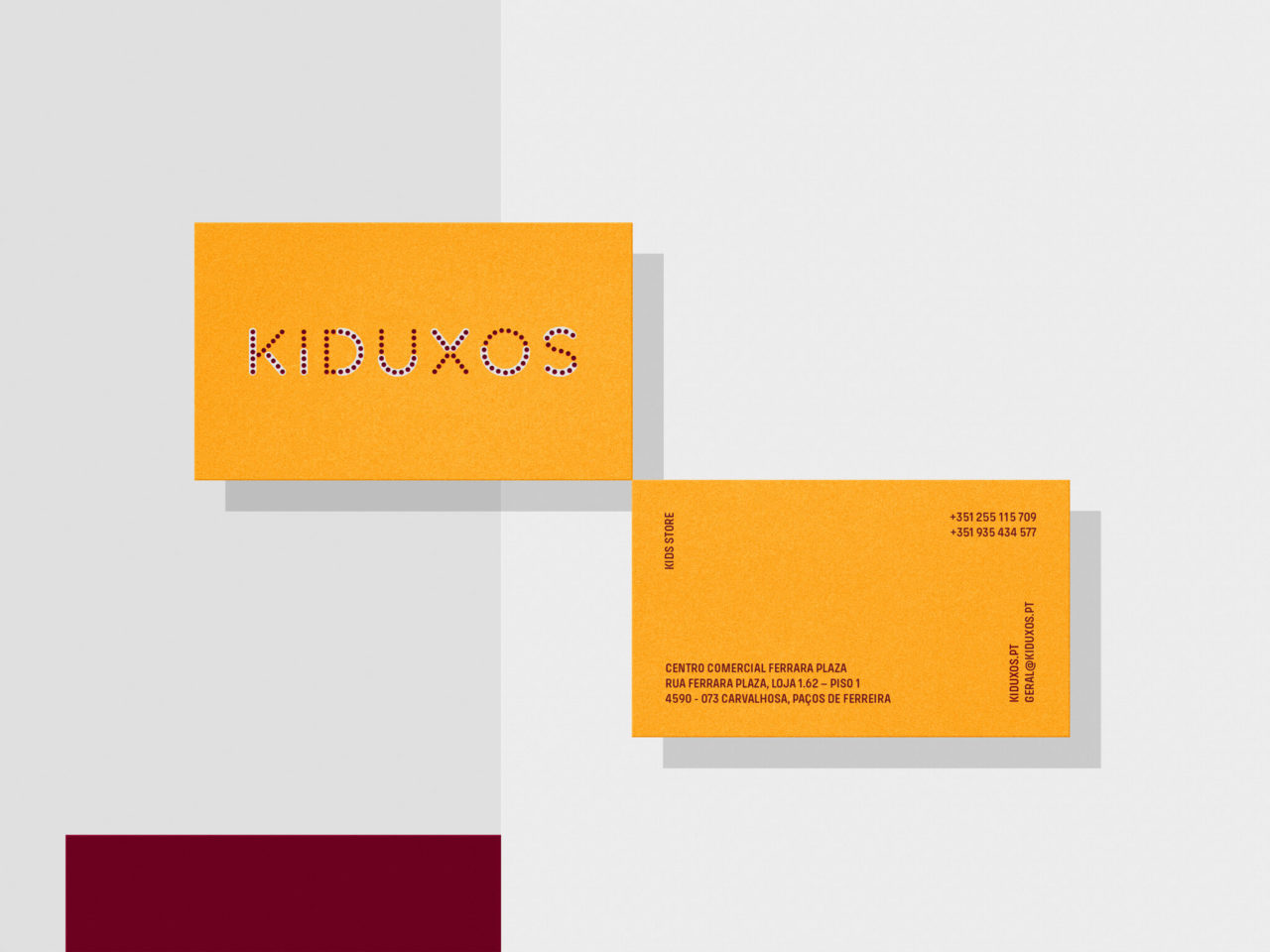
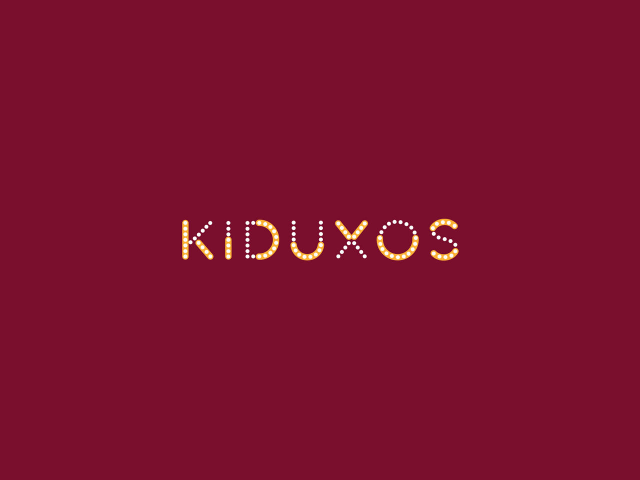
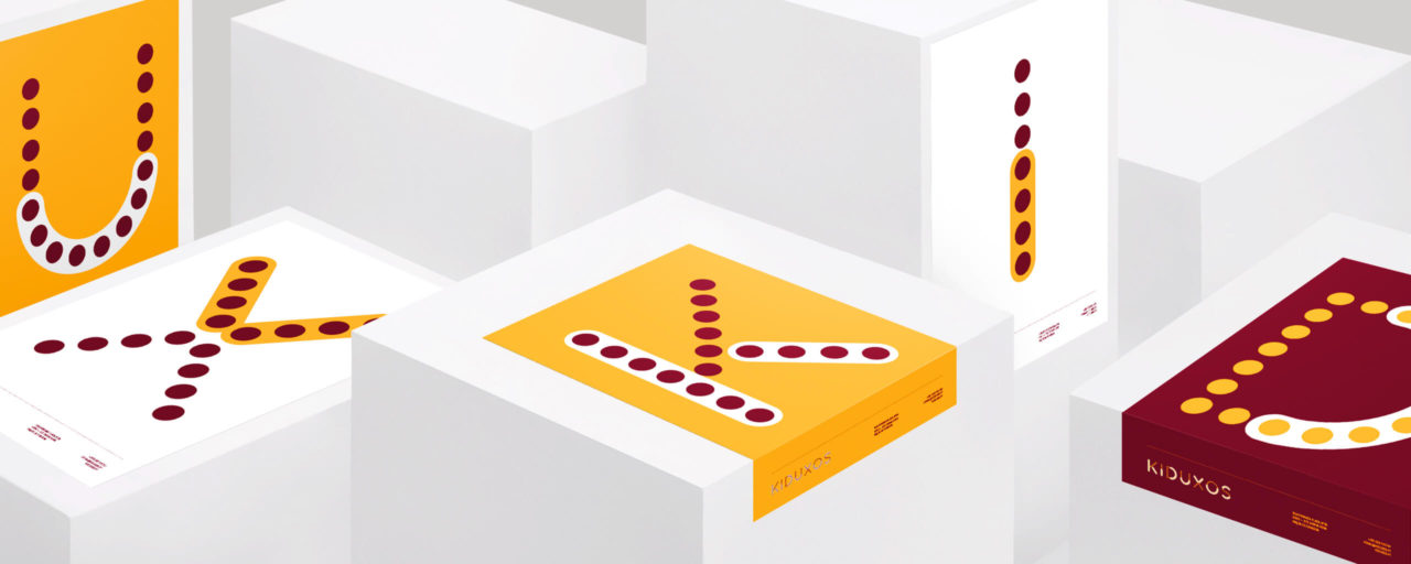
junction of the word KID with the nominal suffix diminutive -uchos, (written with assumed personality of the letter X).
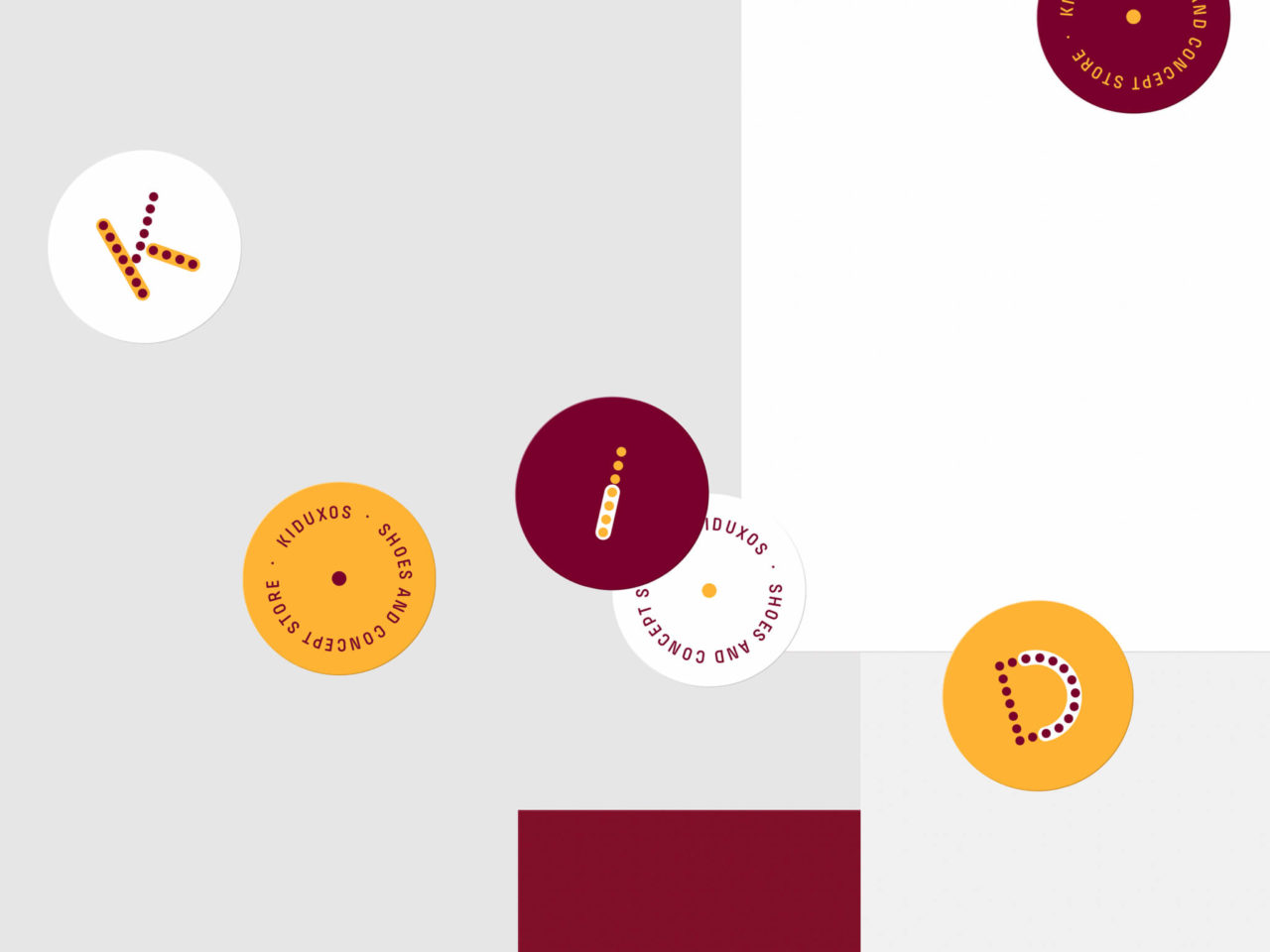
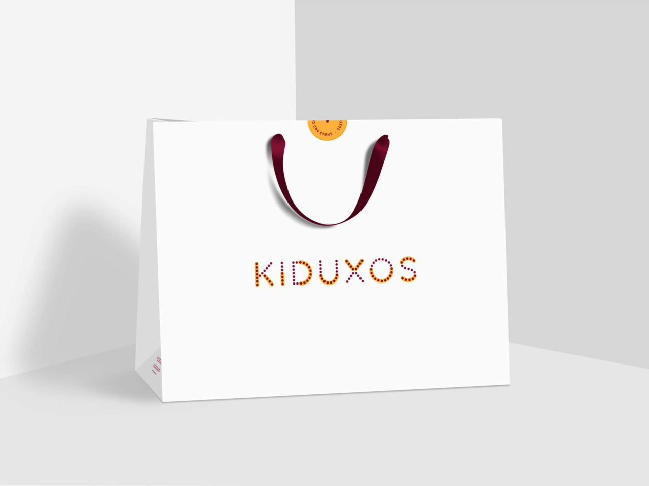
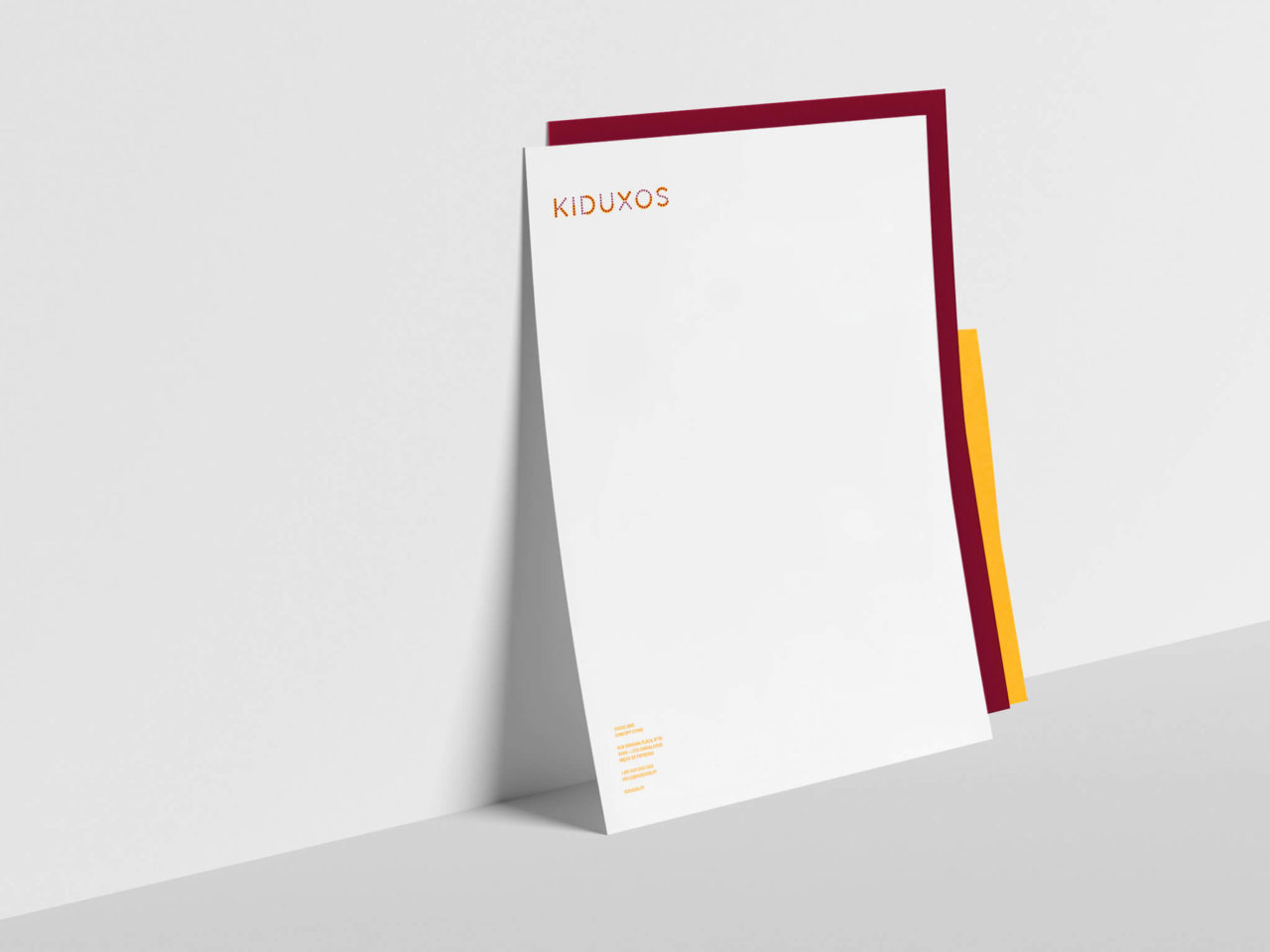
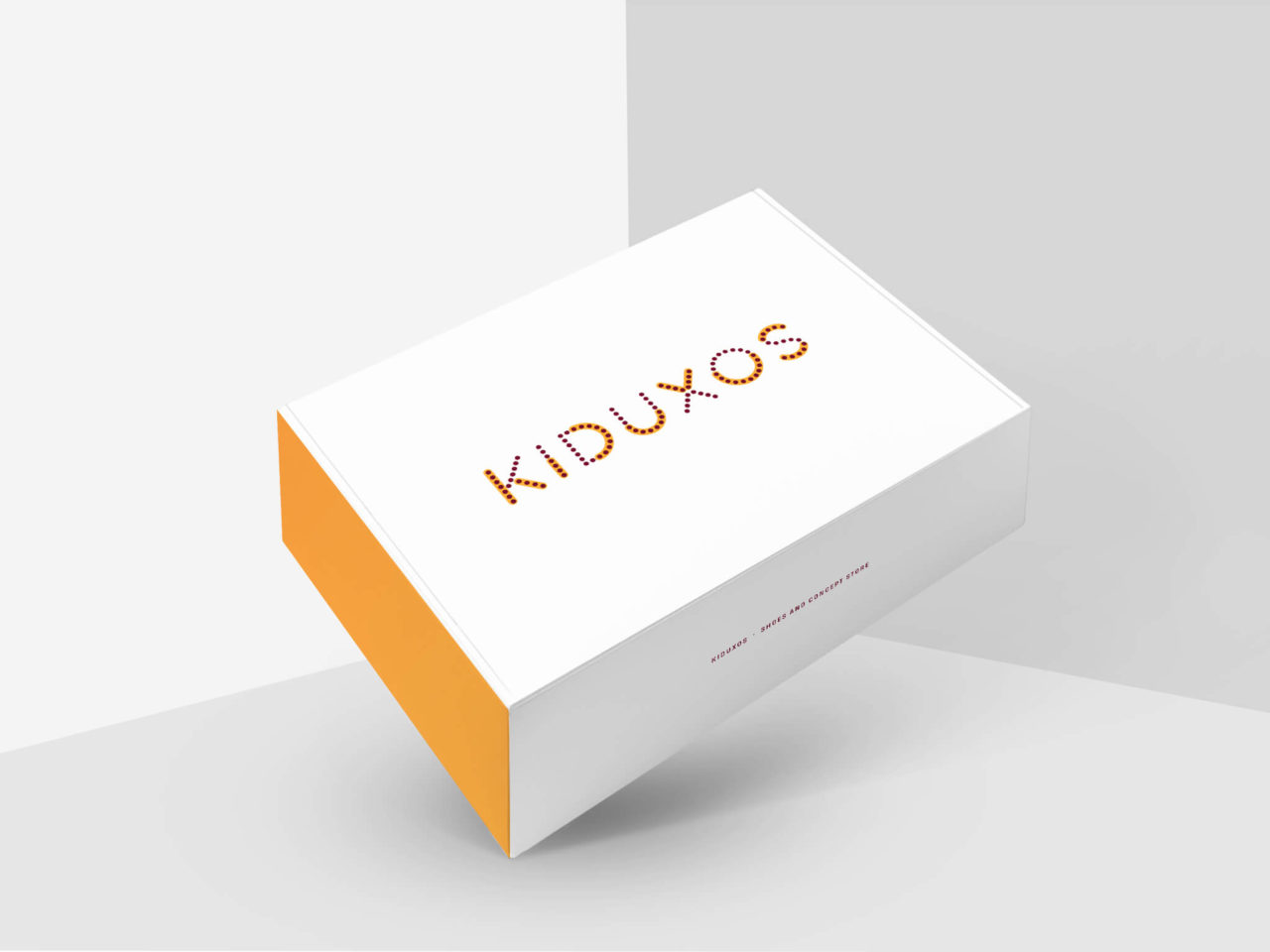
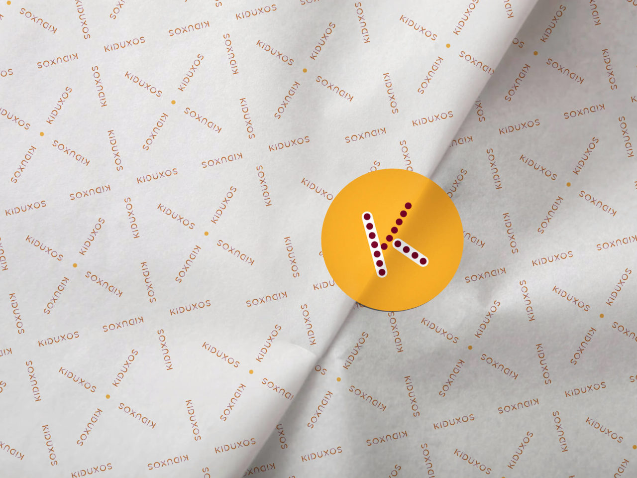
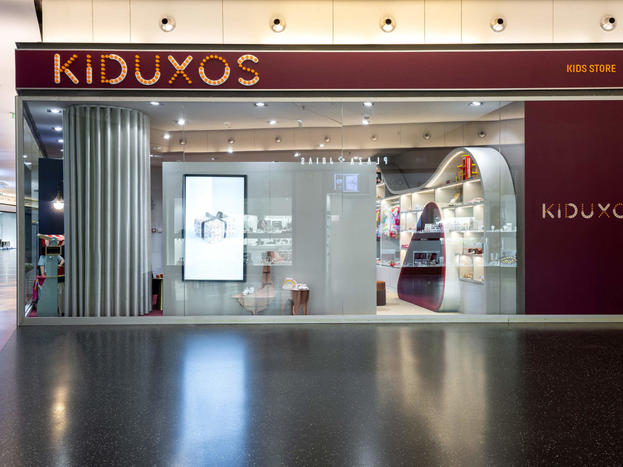
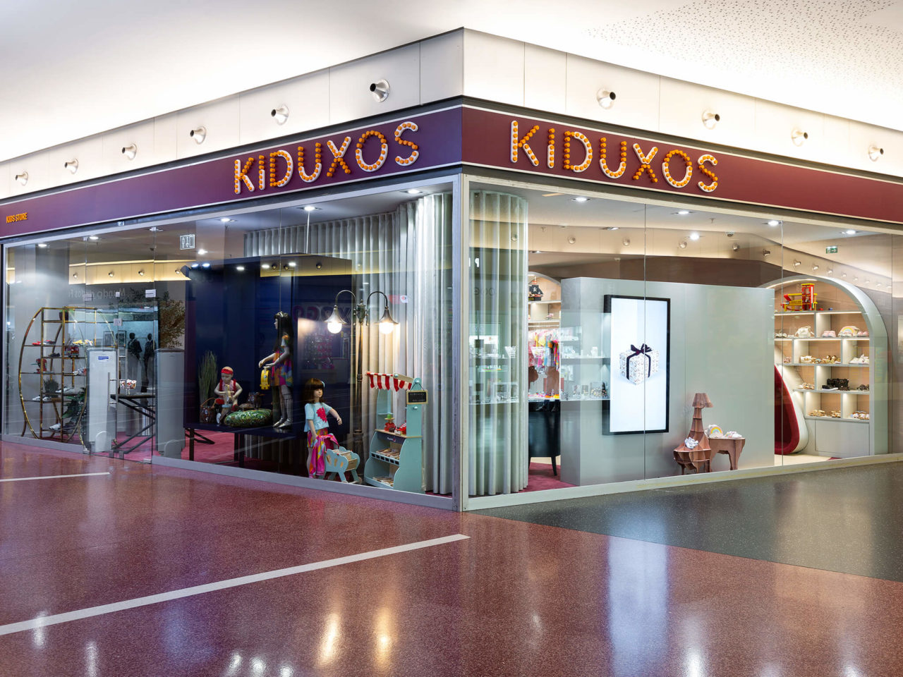
The logo was designed from various elements of interior decoration and stylized with the retro touch of the luminous claims of the old popular fairs.
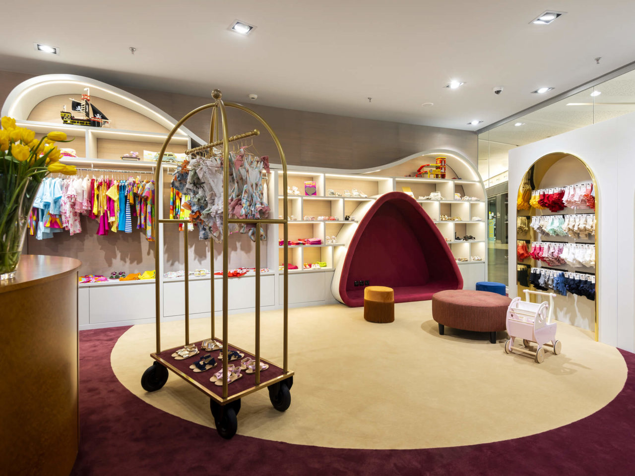
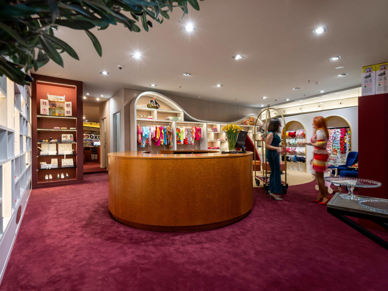
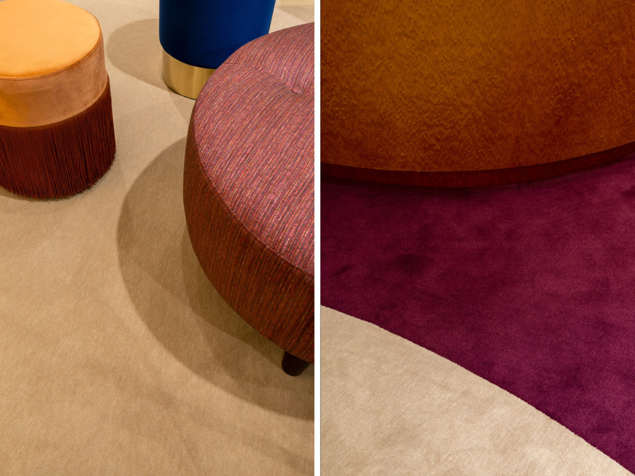
For the purpose of bringing parents and children into a world of fantasy and imagination, the store’s interior design involves every bit of experience in a very distinctive setting. With vibrant colors and textures, a blend of enthusiasm and refinement.
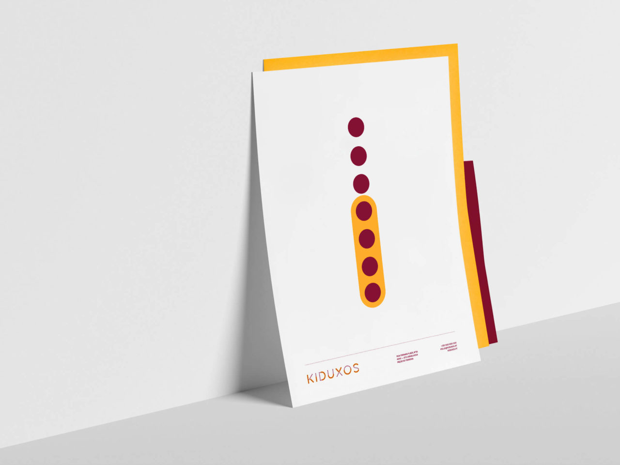
Its visual identity is a reflection of the brand philosophy, that every child deserves to live this experience of fun and beauty.
